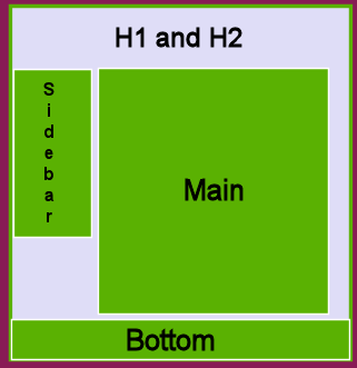
 Looking at the HTML you will see the #main DIV follows the #sidebar DIV. The #main DIV floats left butting the #sidebar DIV. A 15-pixel left margin provides a little space between the twos DIVs. Text-align: left; overrides the text-align: right; set in the body rule. And the 15-pixel bottom margin adds some space before the floral border.
#main {float:left;
 width:70%;
 margin-left: 15px;
 text-align:left;
 margin-bottom: 15px;}
The DIV along the bottom is taking the style indicated by #bottom. It is empty except for its background image. The height of the background image dictated the height of the div. It was allowed to go the whole width of the page. I added background-color in case there were any gaps to fill in. This div uses clear: both; to settle below the two floating divs above.
#bottom {background-color: #881b55;
 background-image: url(../../images/chrybg_2.jpg);
 background-repeat: repeat-x;
 clear: both; height: 200px;}
The rest of the CSS you see in the source is used to enhance other elements. Look over the CSS in the source to understand design techniques employed here. Be sure to post questions on the class forum.
One of the beautiful features of this layout is that the header and navigation column appear to remain static while only the main copy changes. Click through the onsite links to see the effect.
Now you are ready to go back to the lesson and follow a step-by-step tutorial to create a similar layout. More>>>
