|
Catalog Request | Wish List | Shopping Cart |
| Customer Service | Your Account | Search |
If you have found yourself here, you should have already taken Introduction to CSS here at VU, or be otherwise familiar with CSS1. While Introduction to CSS is enjoying continued popularity, some students have asked for more. I thought I would wait until the browsers supported CSS2, and write a nice course on that. But the browsers never seem to catch up to CSS2, so I offer you a course in using CSS to create a variety of page layouts.
We will explore how each layout appears in current versions of Internet Explorer and Firefox. Any one using other browsers is welcome to share consistencies and inconsistencies. Mac users are encouraged to tell us what you find in Safari and Mac versions of IE and Firefox.
Please use the Class Forum as often as you like. If you find a better or simpler way to achieve a design, please tell us about it. Be sure to create an online Table of Exercises with links to your weekly creations. Post your URLs on the classroom forum. Ask questions. Answer questions.
I have provided some copy and artwork you can use to fill your pages. Feel free to use your own if you prefer.
And now...
Into the Cascade
This week we will create some simple familiar layouts. Instead of using tables and frames, we will use CSS. The benefit of using CSS rather than tables is CSS loads faster. Every element of a table has to load before any of the table appears. Without tables, the text will load quickly and bulkier images will come in later, while your visitor is already reading.
And frames, well, they are just ugly and annoying. Some of you newbies may not even remember them. They were once the only way to have static and dynamic elements on a page.
Open your text editor; this can be Notepad, Note Tab, Dreamweaver or a simlar program that allows you to control all aspects of your HTML/CSS design. A tabbed editor will work well here as you may have several documents open at a time. MS Word is not a text-editor; it is a word processor. MS Word is not the correct application for this course.
You can include your CSS within your HTML document or create a separate .css document. It's your choice. If you choose to create a separate .css stylesheet, remember:
‹link href="mystylesheetname.css" rel="stylesheet" type="text/css"›
Embedded style goes within the HTML document head. It is enclosed in style and html comment tags:
‹style type="text/css"›
‹!--

--›
‹/style›
You can use whatever content you would like to for your pages. I offer this content for you. Download and unzip to use it. You may use basic lorem ipsum if you prefer.
You may want to draw the page with pencil and paper first. I usually do. It gives me a reference to work from. I can write the names of the IDs and classes where they will be used. I make note of color choices and image names on the handwritten page.
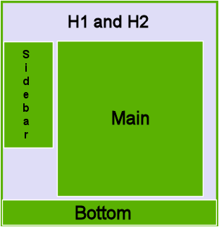
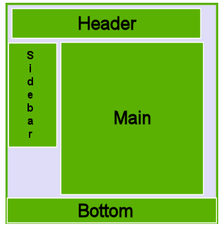
Here's the basic layout, using three or four DIVs:


If the top of your page contains many elelments, a DIV may help you keep the elements organized and together. The DIV may or may not use an ID depending on your needs.

|
Catalog Request | Wish List | Shopping Cart |
| Customer Service | Your Account | Search |
Create and save your .html document and your .css document. Link your .css to your .html
In your .css document, create an ID to define each DIV. For example:
#myhead {width: 100%; text-align: center;}
#navigation {float:left; width: 15%;}
#main {width: 85%; float: left;}
#footer {width: 100%; clear: both;}
Your IDs may have different names than mine. ID and class names may not begin with a digit. Use a name that makes sense in your layout: #biggraybox, #leftcol, #static, #banner. Whatever works best for you.
Now switch to your .html document. Just inside the body tag, place your header. If you are using a DIV, it will look similar to this:
‹div id="header"›
‹h1› My Main Head ‹/h1›
‹h2› My Secondary Head ‹/h2›
‹/div›
Without a DIV it will look simliar to this:
‹h1› My Main Head ‹/h1›
‹h2› My Secondary Head ‹/h2›
Either way, it will look like this until you add some style:
Now you can place your left column div, followed by the right column div and finally the footer div. The DIVs will fall into place. You will need to add text, artwork and style. The DIVs create the layout.
You can define how an element will appear in a specific DIV, by using the same ID. For example, the following rule changes the color of H3s that appear in DIVs with the main ID. All other H3s are not affected by this rule.
H3#main{color:navy;}